NFL
                       
Showing posts with label Bill Schaefer. Show all posts

Sunday, 12 June 2016

Five Years of the GUD

by Larry Schmitt


It�s been a while since I�ve written for the blog, and the Gridiron Uniform Database�s fifth anniversary seemed like a good occasion to come back.

I still remember the GUD�s debut on Sunday June 11, 2011 when it was featured on the front page of Uniwatch.


Having been a fan of football history and uniforms since my teens, this was exactly the kind of site I�d hoped would surface one day. I happily clicked away, browsed and explored for hours that Sunday morning, savoring every visual treat.

Of course, much has changed since then.

Originally the site only went back as far as 1933. The years 1920 � 1932 were added incrementally over the summer of 2012, and many of the templates were empty, as photos for that era, especially for the small town teams, are scarce.


According to the sidebar on Bill�s Update page there have been 1,260 updates to the database�s content since a running count was initiated in January 2012. While many were new discoveries, the vast majority represent a collection of adjustments, refinements, tweaks and in some cases, major overhauls that resulted from the relentless and continuous research to provide the most comprehensive and accurate visual library possible.

While there may be times the GUD appears dormant, nothing can be further from the truth.

Most visitors to the GUD are familiar with the names Tim Brulia (historian & researcher), Rob Holecko (webmaster) and Bill Schaefer (graphic artist & researcher), the official owners of the GUD. There also is a network of GUD frequenters who volunteer their time and assist in large-scale projects and/or forward the occasional historical nugget that might lead to a correction.

You can visit the GUD Forum where some of this takes place. The Forum goes all the way back to the GUD�s second day, June 12, 2011. It serves as a quasi-time capsule to many of the early activities, and you can see some of the source material for what is now represented in the database.
My first contribution to the GUD was offering a color photo of the Giants Charlie Conerly in 1948, which led to a correction of New York�s leather helmets for that season.


That turned out to be the first of many for me. I often spend my free hours perusing the internet for pro football history, whether it�s statistics, player biographies or old photos. Whenever I came across something I thought was interesting I�d forward it to Bill and Tim for their consideration. Over time, they tutored me on developing a sharper eye for researching, a major part of which was identifying mis-dated photos (you�d be surprised how many exist in the Getty and AP catalogs), as well as discerning the subtleties of interpreting colors from black-and-white photos.

  
Why does blue sometimes appear darker than red, and other times red appear darker than blue? The best answer I can offer is: it depends on who took the picture, what type of equipment was used, if filters were involved, the type of film and how it was developed.

In March of 2013 I was invited (and possibly may have even been the stimulus for) my first large scale GUD project, which we termed �The Great Belt Overhaul.� What simply began as a casual surfing of old Earl Campbell photos during my lunch hour at work dovetailed into the correction of at least a dozen teams belt colors, most of which spanned the 1960�s through the 1980�s.

At the time the GUD commonly showed teams with black belts as a sort of default. While discovering that the Houston Oilers belts were white with white pants and blue with blue pants, we noticed that the Pittsburgh Steelers varied yellow and black belts for a similar period. While researching the Steelers we found similar evidence for the New Orleans Saints, and while researching the Saints we found that...well, you get the gist of it. One of our inside saying that we still use came from this endeavor...�While looking for one thing, I found something else...�

It was also at this time that most of my efforts were transferred to email, rather than the forum. I do occasionally add to a thread in the General Comments section of the forum, just for the fun of it. It�s been going for about three-and-a-half years now.


Since that time, some of the other large scale projects undertaken have been the addition of the USFL database in November 2013, the addition of officials� uniforms in the May of 2014, 2015�s deep-dive project into newspaper archives that resulted in the GUD having a nearly complete photographic record of preseason games dating back to 1950, and the debut of AFL II earlier this year.

You�ll also notice that the ongoing endeavor to represent every regular and post season game on a weekly basis currently goes back to 1937, save for a small handful of games from the 1940�s where we haven�t discovered a photo yet.


My conservative estimation is that the GUD currently displays 14,320 weekly matchups in full color � where else are you going to find information like that? And you the reader can be confident that what is displayed is accurate, as no stone had been left unturned while researching libraries and newspaper archives. If a photo cannot be found to back it up, then the templates are left blank. Guesstimations are not good enough.

To that end, while most of us conduct our research online through newspaper archives and libraries, Tim has taken several sojourns to the Library of Congress in Washington DC and the Pro Football Hall of Fame in Canton, Ohio.

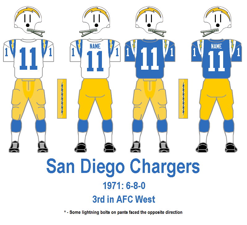
While I most enjoy researching the first three decades of pro football � essentiallythe leather helmet era � I have one modern era project that I remember fondly. One weekend morning in April 2014, while casually looking over photos of the Dan Fouts-era Chargers, I noticed some irregularities in the orientation of San Diego�s lightning bolts on their pants.


I broadened my search to include the 1960�s and found that not only were they facing multiple directions � they could be forward or backward and upward or downward � but over the years the bolts themselves changes shape and size.


I began saving photos in files broken down by era, and while the bolt placements was often erratic, I was able to nail down the style of the bolts definitively. Did you know from 1961-65 the bolts on San Diego�s pants contained eight points on each side, while all other years through 1987 they had seven?


Or that the only year with uniform bolt orientation was 1984?


I�m not sure if Bill recalls this project as fondly as I do. Initially frustrated at the challenging work, he diligently forged a system - over the course of a full year - to accurately present what you see in the San Diego database today. His ultimate balance of persistence and patience paid off in a big way.

Bill himself handled the 1992-present day Chargers bolts research, and along the way picked up on number font variations.


I guarantee you won�t get this attention to detail anywhere else.

So, what�s next? I don�t want to give away too much, but sometime in the near future, the weekly matchups are likely to extend back a few seasons further, and the other AFL�s will ultimately take their rightful place to complete the presentation of every major professional football league over the past 96 years.

There also has been a recent boon in discoveries of missing teams from the 1920�s. Many of the templates that appear blank today will be replaced by full color representations of what these pioneers of the game we all love today wore on the gridiron in near anonymity over 85 years ago

Ongoing corrections and enhancements are always taking place. Recently, many teams have had their catalogues refined with what we call the two-tone effect on their pants (the result of two differing materials, usually with the front being a shiny, satin-like quality). 


There also has been a recent emphasis on fine-tuning jersey number fonts and sizes as well as leather helmet styles. Some of these differences can be seen in places like the weekly matchups as gifs when multiple styles were worn concurrently.


The research section also is updated regularly. Among the information readily available is a log of every instance of and NFL team wearing white at home since 1957 and what is believed to be the most comprehensive representation of helmet decals anywhere.


Rest assured, all of these will be updated continually as the 2016 NFL season proceeds.

Earlier this year, Rob gave the GUD itself a face lift. The front page has been reorganized to better display the content that is available. Several of the pages inside are now sortable, making navigation easier.


He also added some new features that highlight historical facts and firsts.


All that great information aside, what I appreciate most about the GUD is that it is a community. Right from the very beginning Tim, Rob and Bill welcomed all visitors not only to enjoy the content that was presented, but take part in the collaborative journey that is the GUD. They allowed an obsessive fan like myself to feel like a part of the group.

I'm looking forward to the next five years and all the discoveries that await us!

Friday, 13 June 2014

Say It Ain't So, Joe...er, George!

by Bill Schaefer


Many of you, I'm sure, have seen at least parts of the collection of Merv Corning's artwork similar to the George Halas image, and others, above. Mr. Corning was commissioned by the NFL to create the images for the book "The First 50 Years" in 1969. Similar drawings of Ernie Nevers in his Duluth Eskimos uniform and Bronko Nagurski in a psychedelic 1936 Bears uniform have been carved into our collective football souls. But never, never, never, did I believe for a single second that, if by chance one of these famous drawings could be incorrect, it would happen to be the above drawing of "Papa Bear" George Stanley Halas. Recent evidence has turned up that this uniform, very likely, was not worn until the following year (1921), when the Bears Staleys moved to Chicago.

This marks the second time in the last few years that we at the GUD, along with the help of our loyal viewers and contributors, have discovered an erroneous, long-standing misconception of a very early League franchise. If you remember back to October, 2012, our own Tim Brulia penned an article posted on Uni Watch explaining how, despite the claims of the Pittsburgh Steelers, the 'bumblebee' uniform that was made into a throwback jersey that the Steelers have worn the past two seasons and attributed to the 1934 season, had, in fact, only been worn in 1933 (along with the equally detestable 'City Seal' jersey).

As THE Bears fan residing in GUD, it pains me to say that it is extremely, 100% likely that the Chicago Bears organization has NOT always worn navy and orange. "Sacrilege," you say? I couldn't agree more. Up is down. Black is white. Cats and dogs getting along. We're talking the seventh sign of the apocalypse here!

How could this happen? All football fans with a shred of League historical knowledge know how George Halas, a University of Illinois alum, purchased the Decatur Staleys and remade them in the image of his alma mater donning the navy and orange that the Bears have worn for almost 100 years. What we have discovered, with the help of a contributor, identified as "LJP," that no fewer than 6 different articles from the 1920 Decatur Review refer to the Staleys as wearing red (or crimson) jerseys.

Two possibilities exist. The first option is that the reporter for the Decatur Review was color blind and his editor didn't notice any of these 'errors.' The second option, and dare I say the more likely of the two, is that the Staleys actually wore red. In hindsight, I guess we should have seen this coming. After all, since the story goes that he remade the team in the image of the University of Illinois, the Staleys HAD to have been in something else besides navy and orange to necessitate that subsequent change in the first place.

While we don't have enough to substantiate the reason for this discrepancy in the history of the Bears' organization, enough is known that we can assemble a viable postulate for the circumstances surrounding what likely happened over 90 years ago...

In 1920, George Halas moves to Decatur, Illinois, to take a position with the A.E. Staley Company, a starch manufacturer. For the sake of argument, let's assume that the Staley Co. bore red in its logo and the team was supplied with red jerseys. The team takes a financial loss in 1920 despite superior play and Halas buys the team in order to move them to the big city, Chicago. There is a suspicion that a condition of the sale, likely an advertising ploy, is that Halas must retain the team nickname of "Staleys" for one year after moving to Chicago. This would explain the single year of operating as the "Chicago Staleys" in 1921. However, Chicago already boasts a professional football team, the Cardinals, who wear...you guessed it...red jerseys (technically maroon but definitely in the same 'ballpark'). That year Halas refurbishes the team in the navy and orange image of his beloved alma mater, the University of Illinois, in order to appeal to local fans and eliminate any chance for confusion with the Cardinals. With the conditions of his purchase satisfied, in 1922, Halas renames his team the "Bears" because football players are larger than the baseball-playing denizens his team will be sharing Wrigley Field with, the Cubs, thus creating a timeless link between the two franchises. 

There is even a distinct possibility, though unsubstantiated at this point, that the Staleys continued to wear red jerseys early on in the 1921 season before eventually changing colors at some time in midseason but that remains unconfirmed at this point.

Here are the snippets from the Decatur Review that have been brought to our attention...

September 29, 1920

October 3, 1920

October 10, 1920

October 11, 1920

October 25, 1920

December 11, 1920

Because of this preponderance of evidence, the GUD is changing the image for the 1920 Decatur Staleys to a crimson/red version of their jerseys, assuming that the general design was correct and the colors, only, were incorrect. We are, however, holding off on changing the 1921 image to include additional red combinations until such a time as evidence is produced proving that they were, indeed, worn after 1920.


Hopefully, my fellow Bears fans can come to grips with this as I have.

Bill Schaefer


Tuesday, 4 March 2014

What's Cooking?

The offseason is in full swing but we, at the GUD, are never offseason.

Unless you've been living under a rock, you and everyone else in the uni-verse are aware that, not only did Tampa Bay unveil a new helmet a few weeks ago, but, when promising some other uniform updates - while not being anything 'major' - the Bucs pulled a fast one and really let us have it with a complete overhaul.


Many have said "If it ain't broke, don't fix it." I tend to agree. However in working to put together the Bucs' GUD graphics for this season, I have to admit that they are growing on me a bit. Like others, the number font sponsored by Timex, Rolex, Seiko, TAGHeuer, or whomever is still an issue. Given time, I think we'll get used to it. It's not corny like the Vikings' numbers which sometimes have wings/sails/ship parts and sometimes they don't. My question revolves, though, around the 'shininess' factor itself.

Billy Sims, 1980, courtesy Getty Images.
From 1979-81, the Lions wore blue home jerseys that had numbers and stripes that had a metallic, sparkly appearance. After 1981, the NFL made them ditch it. It escapes me as to whether the change was necessitated by the shininess factor itself or whether the numbers (and stripes) added an extra grippy-ness when the ball was held against any of these areas in a fashion similar to the aptly named grip-strips that were attached to many jerseys back in the 1920s and 1930s.


If the shininess was the reason the Lions had to change their jerseys, why would Tampa be allowed to use a similar luminescence 35 years later?

But I digress.

In case you haven't looked recently (past month and a half), Rob has been working diligently to use the offseason's downtime to install dozens of updates to the site since late January and more are yet to come.

On the horizon is a major update that involves a team's entire history.

We will be updating the entire 1960-current history for the Kansas City Chiefs. You may have noticed that the red for the Chiefs (especially in the last 20 years or so) just isn't right. We think so, too. Along with updating the color for all of the Chiefs' images, I am also making modifications to their helmet history. I was never happy with how the early variations were being depicted. I've got it covered now. Their are also some sleeve modifications and revised placements for manufacturer's logos thrown in as well.

This is the second franchise that's gotten a facelift on our site in the last few months. In Rob's updates you'll find where we've updated San Diego's shade of navy from 1989-2006. They now possess the same shade of navy as division rival Denver.

There's another large project that we've got under wraps. We're taking baby-steps on it and every time we get a chance to jump in with both feet, someone (Tampa Bay) grabs us and says "Not so fast, guys. Deal with this first!"

There's never a dull moment here at the GUD so stay tuned!!!
Bill Schaefer

Wednesday, 15 January 2014

Forty-Plus Years of Bliss


A small bit of shameless self-promotion can�t hurt too much.

Back when Tim Brulia and I began putting the pieces together for what would become the GUD with Rob Holecko's help, one of the aspects that I always wanted to include was a portion of the site that would be dedicated to showing what the weekly uniform match-ups were for every week of the regular and postseason for as far back as we could manage.

After accumulating the required information using many far flung resources as Google News, newspaperarchives.com, the Library of Congress, youtube videos, and private collections of NFL photos from GUD members like Larry Schmitt, I wish to inform the GUD viewership that, with the exception of approximately a dozen games (NFL and AAFC) from the 1940s, we know what every other NFL, AAFC, and AFL game looked like from 1940 through the current action leading up to this season�s conclusion in New York City.

At this time, GUD viewership can seek out the weekly uniform match-ups from the 1970 NFL-AFL Merger forward. Several additional seasons have also been completed from the Pre-Merger Era. Currently, Tim and Rob are working together to get the latter half of the 1960s installed and soon after follow up with the rest of the 1960s for both the NFL and the AFL.

Once they reach as far back as the 1950s, in theory, things should progress at a fairly good rate as we will only be dealing with the limited number of NFL teams each week. In other words, less work for each season will be needed.

After that will come the rest of the 1940s, which will likely be the �swan-song� for this aspect of the GUD. Due to pro football�s status as a �second rate� sport behind baseball and college football, less attention was placed towards the League and newspaper exposure, the backbone of our research for the weekly match-ups, was spotty at best.  It is extremely unlikely that we will ever get to the point where we can add contests from the 1930s to this project.

But never say �never.�

Tuesday, 24 December 2013

JOY TO THE WORLD, THE WORLD FOOTBALL LEAGUE!!!


For openers, let me be the first here at the GUD to wish you and yours a very Merry Christmas and a safe and healthy New Year. And now, after throwing caution to the winds and having total disregard for who's been naughty and who's been nice amongst our viewership, the Gridiron Uniform Database serves up a retro piece of holiday fruitcake...The World Football League!


After completing the USFL images a few months ago, the GUD was flooded with comments both thanking us and asking for more. Foremost on the request list was whether or not we'd ever add additional leagues to our site. The original USFL introductory blog article was updated to provide our response.

It was agreed that the NFL Europe and the World League of American Football were never created to be on par or compete with the NFL but were instead founded more as developmental leagues for the NFL and, thereby, a step below professional leagues such as the NFL, AFL, AAFC, and USFL.  Arena leagues were also discounted due to being a completely different sport.  The early incarnations of the AFL from the first half of the 20th century remain a possibility for the future, however exhaustive research would need to be conducted to provide enough useful information to make such an endeavor worthwhile.

Therefore, the only other league remaining currently under consideration for inclusion on the GUD was the World Football League that operated in 1974 and 1975. Shortly after completing the work on the USFL and the ensuing update summarized above, I caught the bug.

My first concern was that, aside from the famous photo of the former Dolphins' backfield wearing WFL uniforms, I'd never seen any of their uniforms. I didn't even know which team's uniform Csonka and friends (above) were wearing!
My other concern was whether or not the teams' logos were already available in graphic form for use to create helmets. No logos were actually used on the jerseys, which made things much easier from my standpoint. Like the USFL, while the logos existed in the public domain, most were in extremely rough forms with every single logo needing improvement in some combination of color, quality, and sharpness in order to meet the level of expectations we have for the GUD. Above is one such example.


The next step in the process was to accumulate photos of each of the teams in game action.  In doing so, a pattern began to become obvious and, truth be told, it brought a gigantic smile to this graphic engineer's face. Ten of the twelve teams in 1974 and another six of the eleven teams in 1975 basically all wore the exact same jersey, pants, and helmet stripe combinations with the only differences being the color combinations. I am assuming that these teams got a 'swinging deal' from a single manufacturer to supply uniforms. I believe the mass-supplier was Russell Athletic; however, I am not entirely sure.

My next issue was identifying some franchise lineages and these were just as convoluted as the USFL's.
- Birmingham's Americans became the Vulcans for 1975.
- The Boston Bulls never played a game before moving to New York before the first WFL season had even started. That team, the New York Stars, played for 14 games before moving to Charlotte, North Carolina. The Charlotte Stars played one game before further revising their identity as the Charlotte Hornets for the remainder of 1974 and into 1975.
- The Chicago Winds played only 5 games in 1975 before folding. For their final game, they replaced the plain, capital 'W' on their helmet with the logo that was reportedly supposed to have been used from the start of the season but is believed to be the victim of a late arrival after the first four games of the season were played - literally a 'one-game' logo.
- The two franchises in Chicago (1974's Fire and 1975's Winds) are unrelated.
- The Houston Texans moved in midseason during 1974 to Shreveport and became the Steamer.
- 1974's World Bowl runner-up, the Florida Blazers, moved to San Antonio for 1975 and became the Wings.
- 1974's Jacksonville Sharks were renamed the Express for 1975.
- The Portland Storm was renamed the Thunder for 1975.
- Only 4 franchises � the Memphis Southmen, the Hawaiians, the Philadelphia Bell, and the Southern California Sun � played all of their games in two seasons under the same name.

Despite completing the project to the best of my abilities, there are some lingering issues. 


Memphis altered its logo by adding orange for 1975. I have seen photos showing different fonts on the orange jerseys in 1975 � identified by the orange-inclusive helmet logo. In 1974 and 1975 it appears that some players wore plain white sanitary socks below their regular orange socks while others wore striped 'sanies' below the orange regulars. Above are the 2 different logos as well as two different sets of sanies and nameplates - both from 1975.


The Houston Texans/Shreveport Steamer franchise shows some irregularities with their nameplate fonts - a seriffed font evolving into an outlined, seriffed font.


Some claims exist that a few teams, namely Philadelphia and Detroit, wore both grey facemasks and colored facemasks. Indications vary as some believe this was allowed to happen with no thought towards uniformity while others claim that the grey facemasks were simply the result of the yellow paint chipping off of originally grey facemasks as the season progressed. We may never know the truth, but the photo above tends to make me lean towards a peaceful co-existence of originally grey and yellow facemasks.


The Birmingham Vulcans appear to have worn two different versions of the white jerseys in 1975. One version had blue numbers outlined in red with a typical blue nameplate font. The other version had blue numbers without an outline and a much smaller nameplate font. My guess is that the latter were similar to the mesh jerseys also worn by NFL teams in the 1970s based on the weather conditions at game time as opposed to the durene jerseys generally worn during colder weather. This may also have been the cause for the different fonts on Memphis' 1975 jerseys noted above, as well, however those Memphis jerseys showed no other disparity other than the nameplates.


The Hawaiians began the 1974 season with a helmet logo depicting a white-faced Hawaiian native but changed it at some point to a pinkish skin tone. There is a possibility that at some point the skin tone was further darkened to a brownish shade but I have been unable to find photographic proof of this as yet. Their jerseys also had enormous nameplate fonts!


There also exists the rumor that the Jacksonville Express played part of their 1975 season with a helmet logo with a white background. However, all photos I have uncovered show the logo's background color to be the same yellow as the helmet.

While similar to the USFL project in that I hope the addition of the WFL will add to the casual fans' knowledge of a very small, unique slice of pro football history, it differs in that, due to my age, unlike the USFL, I have absolutely no recollection of the league that played up until I was 3 years old. In some cases, it's been easier to find NFL photos from the 1930s and 1940s than it has been to find photos of the WFL less than forty years after it ceased operation.

As with the rest of the site, if you have any photographic proof that contradicts what we've added, by all means post your evidence in our Forum as our mission to "Just get it right" continues to live on.


Bill Schaefer